Getting Started with Burndown Charts
In the dynamic world of agile project management, the ability to visualize and track the progress of projects is crucial. Enter the burndown chart – an indispensable tool for agile teams that offers a snapshot of work completed against work remaining.
Table of Contents
ToggleThis guide delves into the intricacies of burndown charts, illuminating their role in driving successful project outcomes.
What is a Burndown Chart?
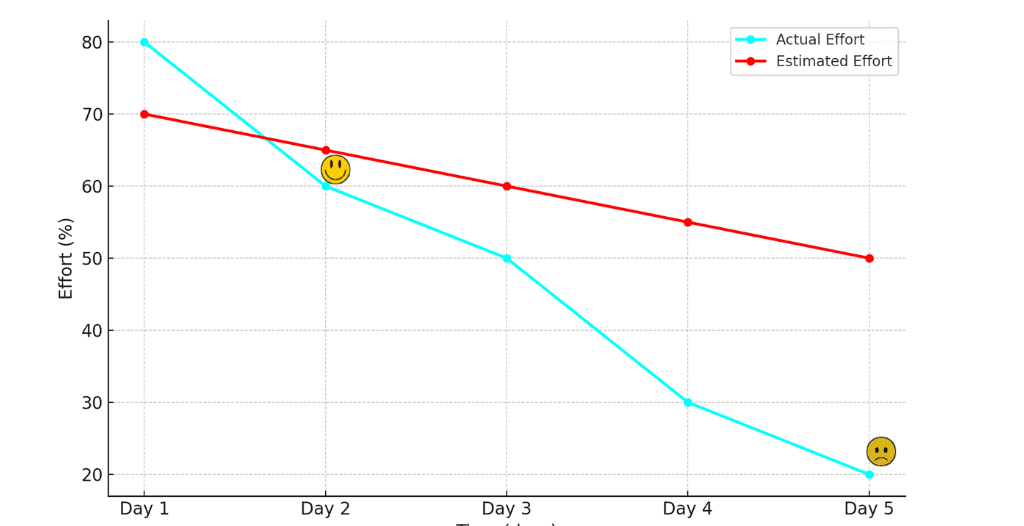
A burndown chart is a tool that provides a visual representation of work progress against time.
It is mainly used in agile project management and software development but can be used to help manage any type of project.
The charts are an excellent way to track projects, providing a clear view of the progress from start to finish and helping to determine the remaining effort.
Components of a Burndown Chart
A burndown chart has several key components, each playing a key role in illustrating the project’s progress.
Understanding what these components are is important for effective use of the chart in agile projects.
Axes
Vertical Axis (Y-axis): Represents the amount of work remaining. This can be quantified in various units, such as hours, story points, or task numbers. It’s a good idea to choose a unit that best reflects the work and is easily understandable by the team.
Horizontal Axis (X-axis): Denotes time, typically segmented into days, sprints, or iterations. It provides a timeline for the project and is used to track progress.
Ideal Work Remaining Line:
Represents the optimal work completion path, starting from total work and descending against the vertical axis towards the project’s end. Sometimes, a straight line is also added to represent a balanced workflow.
Actual Work Line
Displays real-time progress against the vertical access and any variation from the ideal line, reflecting the team’s actual performance.
Story Points
Each point on the work lines represents a measurement of work remaining at a given time. Regular updates to these points will maintain the chart’s representation of the true situation.
Annotations
The chart can include annotations/notes that help to explain any deviations, adjustments, or significant events affecting the project’s progress. These annotations provide context to the visual data and help to understand the team’s performance and any challenges faced.
Legend
For complex projects a legend is used to differentiate between different work types or teams.

Types of Burndown Charts: Sprint, Release, Product, and Epic
There are several types of burndown chart.
Each type provides unique insights for different levels and different types of projects, from individual sprints to overarching product developments.
This brief guide explores their distinct roles and benefits.
Sprint Burndown Chart
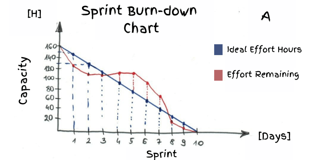
This type of chart is used primarily in conjunction with the Scrum methodology.
It tracks the work remaining in a specific sprint, typically measured in story points, days, or hours.
The sprint burndown chart helps teams understand how much work is left to be done to meet the sprint goals and is updated daily as the sprint progresses.
Release Burndown Chart

Unlike the sprint burndown chart, which focuses on a single sprint, the release burndown chart tracks the progress of an entire release.
This usually covers multiple sprints and provides a broader view of the project’s progress toward a particular release goal.
It is particularly useful for long-term planning and tracking.
Product Burndown Chart
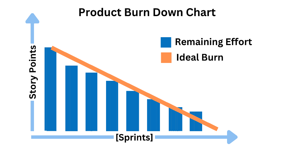
This chart tracks the overall progress of the entire product development. It’s a high-level view that shows how quickly the team is working through the product backlog.
This type is often used in product management to gauge the overall pace and direction of the product’s development.
Epic Burndown Chart
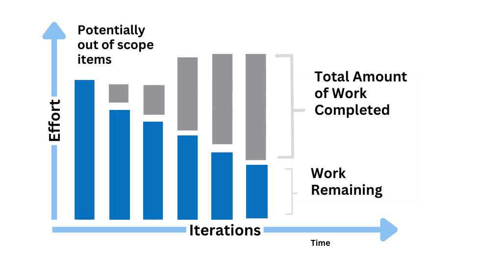
Used to track progress on a larger scale, the epic burndown chart monitors the completion of epics, which are substantial bodies of work within a project.
This chart helps teams understand how they are progressing on these larger chunks of work over time.
Purpose and Benefits of Burndown Charts
The purpose of a burndown chart is to enable teams of all expertise levels to manage and deliver projects effectively.
They offer several benefits over traditional tools like Gantt charts, as they enhance transparency, facilitate improved planning and forecasting, enable early identification of issues, promote team collaboration, and more.
Creating a Burndown Chart: A Step-by-Step Guide
Creating an effective burndown chart is a systematic process that requires careful planning and execution. Here’s a step-by-step guide, illustrated with hypothetical examples to clarify each step:
Data Collection
Gather Essential Data: Start by collecting comprehensive data about the project’s scope and timeline. This includes the total number of story points or the estimated hours required for completing the tasks.
Example: Imagine a project with a total of 100 story points, planned to be completed over a 10-day sprint.
Chart Setup
Plot the Ideal Work Remaining Line: On your chart, draw the ‘ideal work remaining line’ based on your initial data. This line represents how you expect the tasks to be completed over the course of the sprint.
Example: Your chart might start with 100 points on the leftmost point (day 1) sloping down to 0 points on the rightmost point (day 10), indicating a steady completion of tasks.
Regular Updates
Track Actual Work Line: Update your chart regularly with the actual progress. This includes marking the actual work remaining as tasks are completed each day.
Example: If by the end of day 3, your team has completed 30 points, plot this on the chart at the day 3 mark, indicating 70 points actual work remaining.
Monitor Daily Progress
Maintain Daily Tracking: Keep a daily record of the tasks completed and the time spent on each. This helps in accurately updating the burndown chart.
Example: If on day 4, your team completes an additional 20 story points, your actual remaining work would be 50 story points, which should be plotted on the chart.
Analyze and Adjust
Evaluate Progress: Regularly analyze the chart to identify if the project is on track or if adjustments are needed.
Example: If you notice a consistent lag between the ideal line and the actual work remaining line, it might indicate the need to re-evaluate task allocations or sprint goals.
Final Review and Update
Reflect Final Status: At the end of the sprint, review the chart to reflect on the project’s progress and the team’s performance.
Example: Your final chart might show that the actual work line meets the ideal line on day 10, indicating successful completion of the sprint goals.
Common Limitations and How to Overcome Them
Despite the benefits, a burndown chart can also have limitations:
Inaccurate initial estimates can harm the chart’s effectiveness. To counter this, teams must ensure precise sprint planning
Late or poor progress updates can lead to wrong decisions. Team members must report progress honestly and on-time. Adapt the chart as the project progresses.
To counter complex charts, teams can complement a burndown chart with a burnup chart.
Complementary Tools and Agile Practices
A burndown chart can reach its full potential when integrated with other agile project management tools and practices.
These complementary elements not only enhance the chart’s utility but also contribute to a holistic view of project health and progress.
Agile Tools
Project Management Software: Tools like Jira, Trello, and Asana offer digital platforms for creating and updating burndown charts. These tools facilitate real-time tracking of progress and can automate some aspects of chart updating.
Collaboration Platforms: Tools like Slack and Microsoft Teams ensure seamless communication among team members. This constant communication is vital for updating and interpreting burndown charts accurately.
Time Tracking Software: Integrating time tracking tools can provide more accurate data for the burndown chart, especially when tasks are measured in hours.

Agile Practices
Daily Stand-Ups: These short, daily meetings allow teams to update each other on their progress and any obstacles they might be facing. This information can be directly used to update the burndown chart, making it a current reflection of the project’s status.
Sprint Planning Meetings: In these sessions, teams decide what work will be tackled during the sprint. This planning forms the basis of the burndown chart’s ‘ideal work line’.
Retrospectives: Held at the end of each sprint, retrospectives provide an opportunity to reflect on what went well and what didn’t. Insights from these meetings can be used to adjust future burndown charts and improve estimation and planning processes.

Product Backlog Maintenance
A well-maintained product backlog is crucial for an accurate burndown chart. Regular grooming sessions ensure that the tasks are well defined, prioritized, and estimated, providing clear data for the chart.
User Story Mapping
This technique helps break down large user stories into smaller, more manageable tasks. By visualizing the user journey, teams can better estimate the effort required for each task, leading to more accurate burndown charts.
Velocity Tracking
Measuring the team’s velocity, or the amount of work they can complete in a sprint, helps in setting realistic goals for future sprints. This directly impacts the reliability of the burndown chart.
Advanced Tips for Optimizing a Burndown Chart
To maximize the value of a burndown chart:
Leverage Past Performance: Use historical data to refine future estimates, enhancing the chart’s accuracy.
Monitor Efficiency: Pay close attention to the “efficiency factor,” which reflects how quickly the team is burning through the tasks.
Adapt to Fluctuations: Be prepared to adjust the chart when the “actual work line fluctuates,” indicating changes in team pace or project scope.
Final Insights on Burndown Charts
Burndown charts are more than just a project management tool; they are a visual compass guiding agile teams towards successful completion.
By understanding and effectively utilizing these charts, teams can enhance their efficiency, maintain project momentum, and achieve their goals with greater precision.

